
Signage Learning Center
How effective signage and graphics can help your business
Signs and graphics serve three important purposes: to inform, direct and sell. The general impression a person can have on a business and organization is often because of their signage or graphics. By having an effective sign and graphic; businesses and organizations of all kinds can make the most of that first impression.
Signs are crucial to businesses and organizations of all kinds. Signage can make consumers aware of a business, organization, service, or even events. They can help prompt purchases, change decisions on a purchase, attendance, financial support, and even build brand equity.
Signage is inexpensive, yet it’s a very successful form of advertising. During a slow economy, advertising is essential and it can help create a long-term competitive advantage. By maintaining an advertising presence signs, will help build a long-term brand awareness. Effective signage can also be a determining factor by influencing customers or supporters.
Sign Buyer’s Checklist
A short questionnaire to help you identify your signage needs and guide you on good recommendations for your project.
- The use of your sign: Are you directing, informing or selling?
- Display times and conditions: Temporary or permanent? Indoors or outdoors?
- Viewing distance and time: How far will readers be from the sign? How much time will they have to read it?
- Image you want to show: Professional? Sophisticated? Youthful? Fun? How should it coordinate with your other graphics and advertisement?
- Your main customer base: Whose attention do you want to attract?
- Mounting your sign: Where will the sign be displayed? How will it be attached? Will you need the approval of a landlord or a local sign code authority?
Choosing Right Sign Colors
Use contrasting colors when designing your sign. Text colors with a contrasting background significantly increases the impact and visibility of your sign by making your text stand out more.
The font type that you choose can also impact the visibility of your text. Very thin fonts and script fonts can potentially decrease visibility. When choosing fonts, you should select a bold style that is easy to read and sufficient spacing between letters (kerning).
Effective Signs
Signage is usually the first thing that customers or potential supporters notice, so it pays to make sure your signs make a good first impression. Using imagination and proven design methods, we can help you turn your ideas into beautiful, high-impact signs and graphics that bring results.
The most effective signs are enhanced with Color and Images
Did you know that ads with photos have 300% greater recall than ads without photos?
- Best – Full color graphics have the highest awareness of all sign categories.
- Better – Adding a border to your sign helps focus your customer and supporters attention so they can read it 26% faster. And by presenting special information in a secondary color, you an increase their retention by 78%-and draw a better response.
- Good –Signage builds awareness through low-cost, multiple impressions, reinforcing your advertising messages in other media.
Visible
Make sure your sign and its message are visible from a standard viewing distance- and that the sign is easily distinguishable from its surroundings. When you don’t have room for large-sized letters, try using light colored letters on a dark background. The contrast will make the lettering appear larger, and viewers will find it easier to read.
Readable
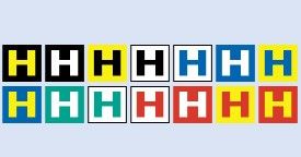
Make it easier for customers and supporters to read your message by choosing a design that distinguishes individual letters. Studies have shown that black lettering on a yellow background or yellow lettering on a black background are the easiest color combinations to read, especially at a distance. Ask your Signs2Go professional for good examples of other readable color combinations.
Noticeable
Draw your customer’s attention to your sign by changing its message, color, size or shape frequently.
Legible
Let us help you choose the right typestyles and spacing to help your customers distinguish words and letters.
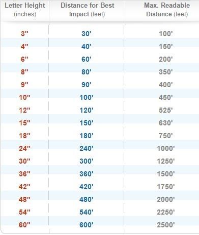
Visibility Sign Letter Chart
Choosing the correct signage letter height
When designing, make sure your target audience can read what you want to tell them. The size of the letters and logos, as well as the colors you choose, are crucial in creating a visible, easy-to-read sign.
Every 1-inch of letter height provides 10 feet of readability with the best impact.
Sign Location
Consider how you will be using your sign, as well as how far away the readers you want to impact will be. For example, if you are placing a sales advertisement inside your retail store, your text only needs to be visible to the people in the store. 1-2” letters, or smaller, would work just fine. However, if you are hanging banners and want drivers on a nearby highway to be able to see them, design your letters at 3” or even larger